Heat map
The University of Maryland has an excellent history and explanation of heatmapsand coverage of treemap software offerings. There is an extensive set of variations of how to implement heatmap visualization.There are different types of heat maps. The two most commonly used heatmap types are treemaps and geographic (thematic) maps.
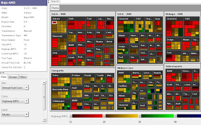
Treemap

Tree maps maps aid in identifying critical issues, allocating resources and finding trends or relationships in data sets by showing the line items from datasets in a visual format that the brain is more capable of percieving. This allows anomolies, distributions, relationships and trends to be identified.
Treemaps are often applied to stock market analysis, risk management, project portfolio analysis, market share analysis and network management.
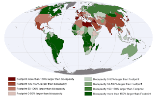
Geographic (thematic) maps
Geographic heat maps highlight anomalies, trends and distributions across a geographic area by taking each entity on the map, such as a country or state and coloring that entity with a single color to represent the data value for that entity.
Geographic heat maps are typically used for market share analysis, risk distribution analysis and real estate market analysis.
One excellent tool to support people making thematic maps (or even web sites) is the Color Brewer web site (http://colorbrewer2.org/).
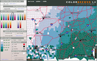
Color Brewer was built by the authors of Designing Better Maps: A Guide for GIS Users and provides guidance as to how to mix and match colors, including color-blind friendly, print friendly and photocopy friendly color schemes.
Proportionality / relativity table
|
Country
|
Number of Spanish Speakers
|
(approximate; X=10,000,000 people)
|
|
Mexico
|
91 million
|
X X X X X X X X X
|
|
Colombia
|
41.9 million
|
X X X X
|
|
Argentina
|
35.6 million
|
X X X
|
|
Spain
|
29.9 million
|
X X X
|
|
Venezuela
|
23.3 million
|
X X
|
|
USA
|
20.7 million
|
X X
|
|
Peru
|
20.4 million
|
X X
|
|
Chile
|
13.6 million
|
X
|
|
Ecuador
|
11.8 million
|
X
|
|
Dominican Republic
|
8.2 million
|
X
|
Video
Here’s an interesting animation. You could display it in a meeting and tell a user story over the top of it instead of traditional power point shows.
Breaking waves simulation. Found on the Wired Sciencesite.
Graphic designer Nicholas Felton visualizes numerous details about himself in personal “Annual Reports.” In this video Felton examines what a weeklong-snapshot of New York Times’ front pages reveals about America. Found on the Poptech site.
http://www.excelcharts.com


Leave a Reply